


Choosing your colors is one of the most exciting parts of planning a spring wedding, and finding the right spring wedding color palette can make the entire design process feel intentional and inspiring. Your color palette sets the tone for everything—your invitations, florals, signage, tablescape, and overall aesthetic. As a luxury wedding stationer serving couples in Cleveland and beyond, I love helping spring couples bring their vision to life through thoughtful, cohesive design. If you’re planning a spring wedding and looking for elegant inspiration, these curated palettes are the perfect place to begin.
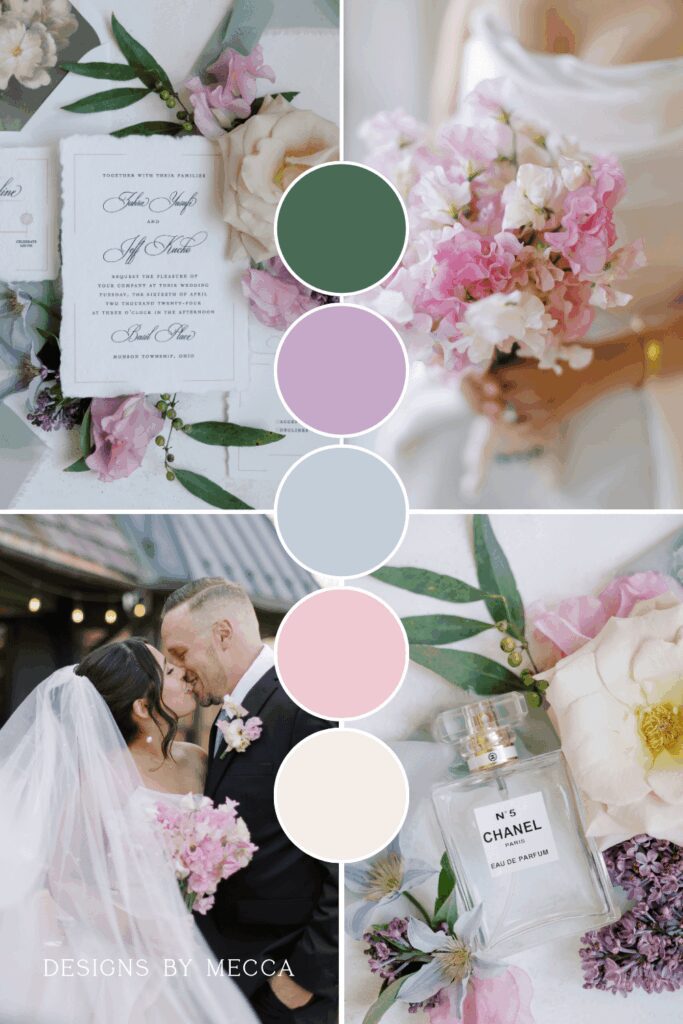
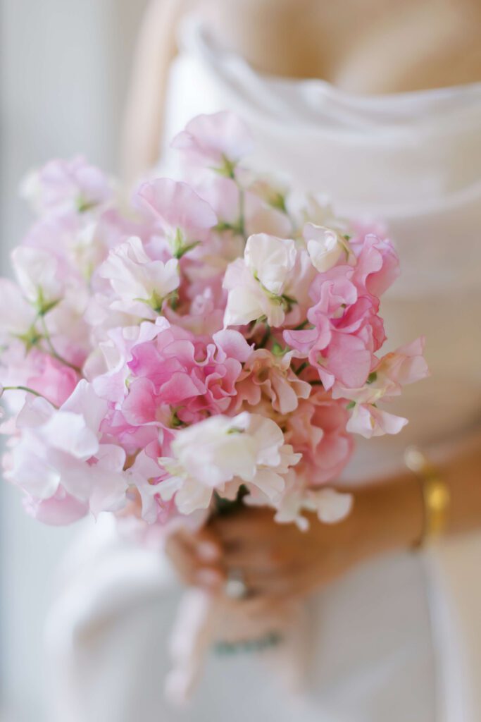
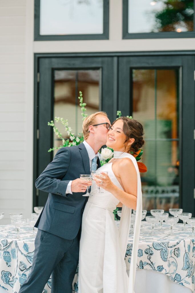
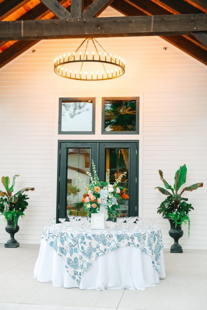
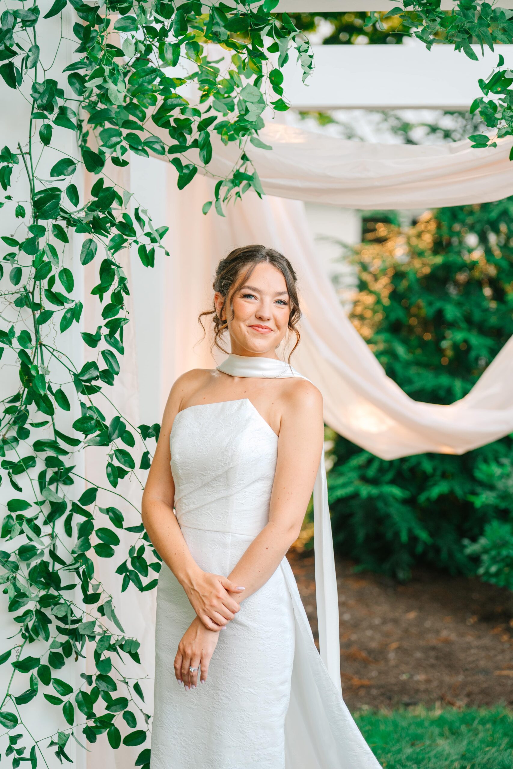
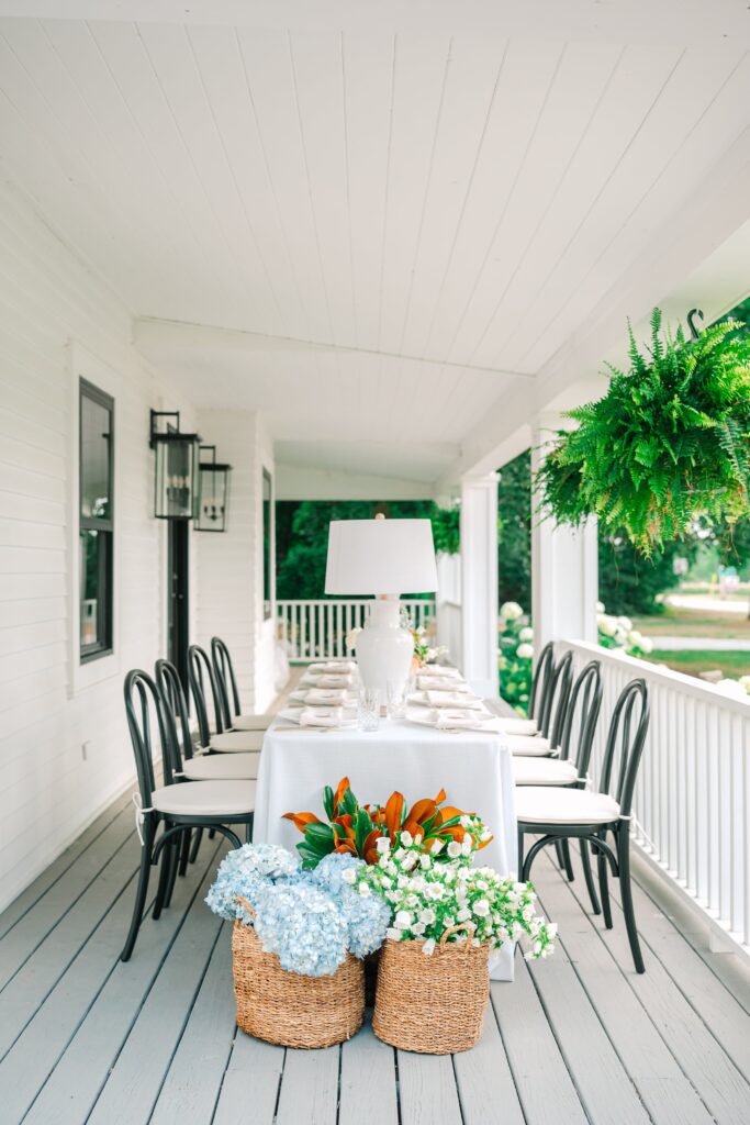
Lavender, Dusty Blue, & Blush
If you’re drawn to soft, airy pastels that feel romantic, this palette is a beautiful choice. Lavender adds freshness, dusty blue brings a calm elegance, and blush warms everything up with a gentle, timeless touch.
For stationery, this combination works perfectly with watercolor illustrations, delicate floral artwork, and envelope liners that highlight these soft spring tones.
Best for: Garden venues, courtyard ceremonies, or elegant estates with natural light.
Pin this inspiration for later!
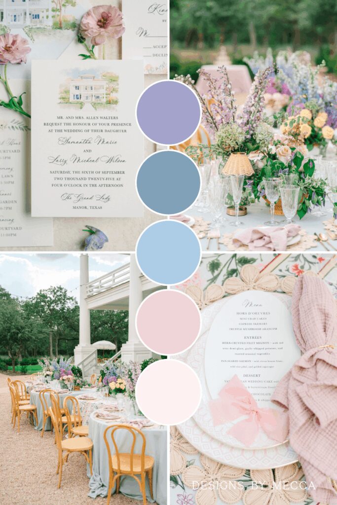
Images: Sarah Thompson Photography (top) & Heather J. Photography
Love this palette? See more inspiration from this elegant garden wedding at The Grand Lady!
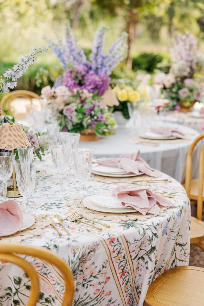
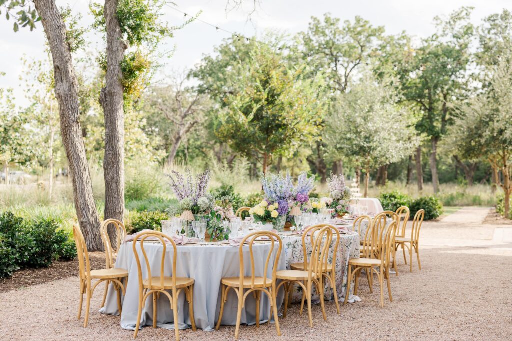
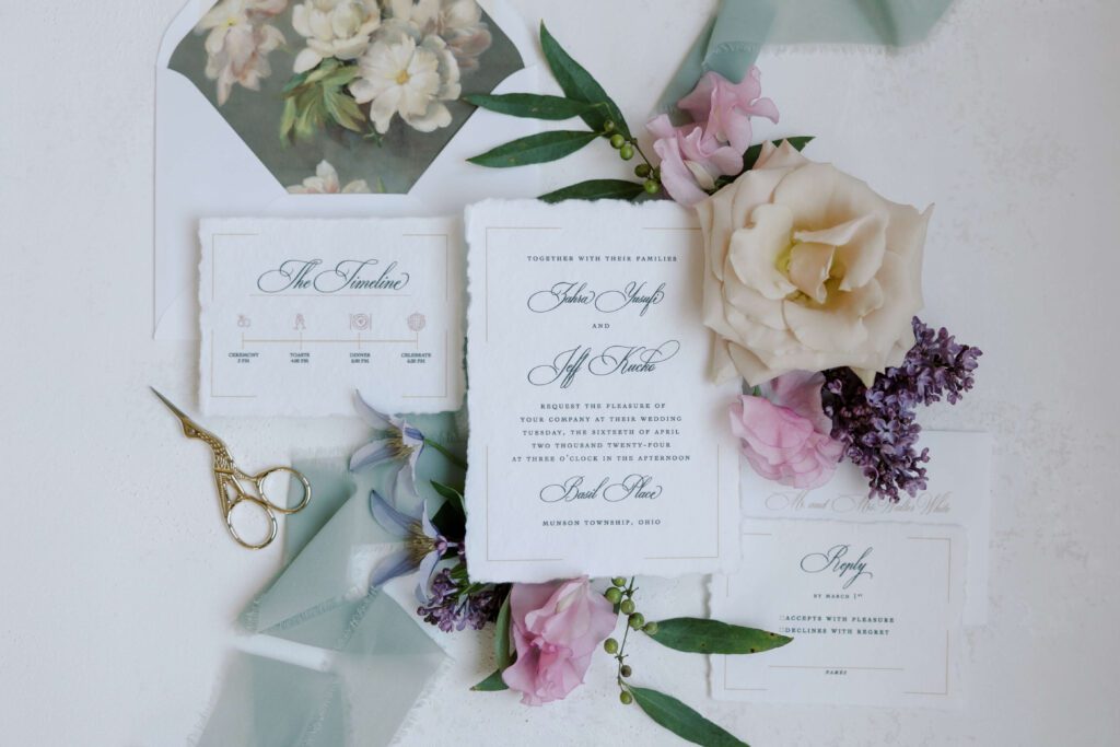
Green, Lavender, Powder Blue & Petal Pink
This palette is perfect for couples who want a fresh spring look with a soft, romantic feel. Meadow green adds a natural, grounding touch while soft lavender and powder blue bring gentle elegance. Blush pink ties everything together with a warm, airy finish that feels timeless.
For stationery, this combination works beautifully with textured papers, delicate floral artwork, and envelope liners that highlight the pastel tones in this palette.
Best for: Garden weddings, romantic outdoor ceremonies, or elegant venues with natural greenery.
Pin this inspiration for later!
Images: Avra Studio
Love this palette? See more inspiration from this romantic spring wedding at Basil Place!
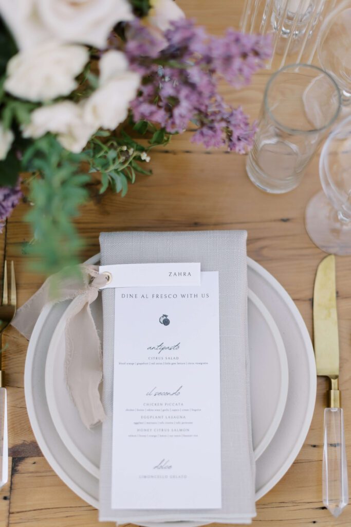
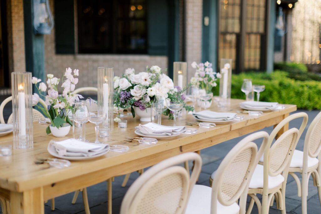
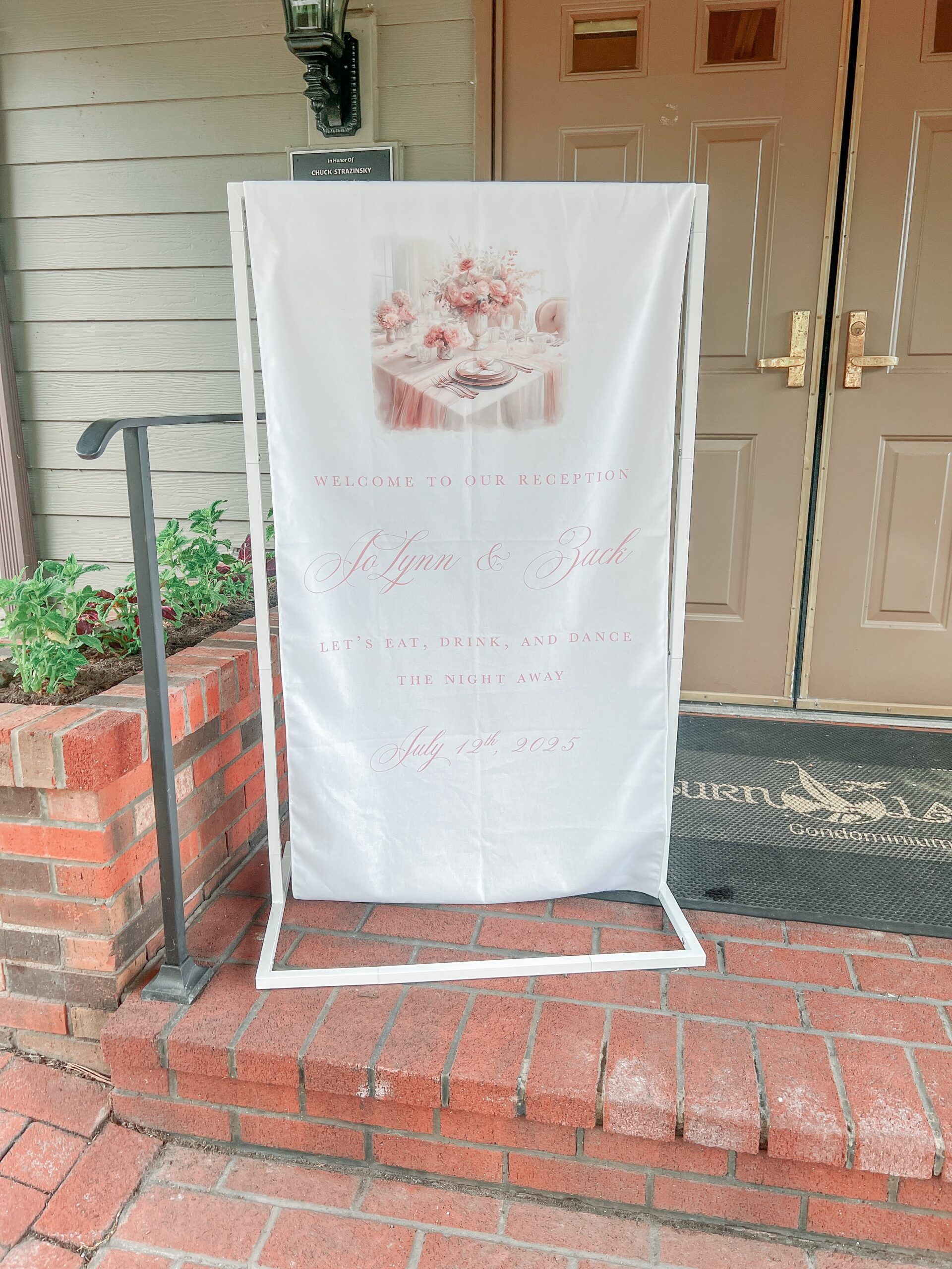
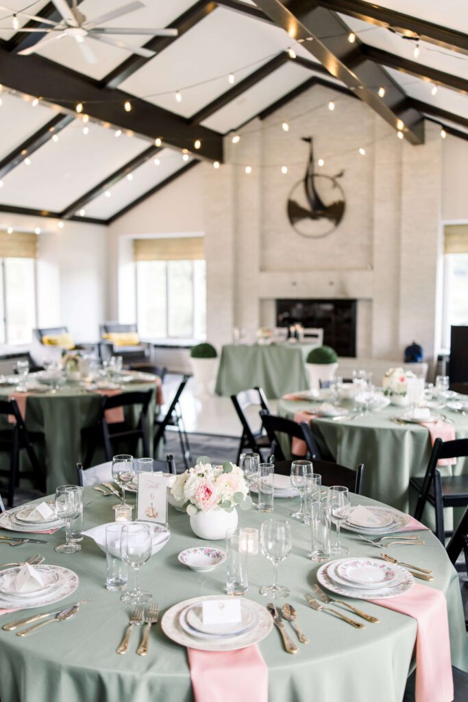
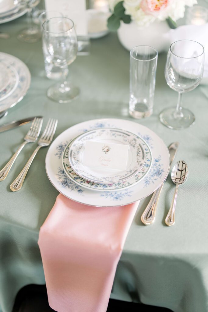
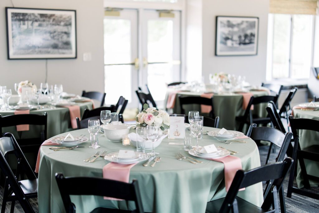
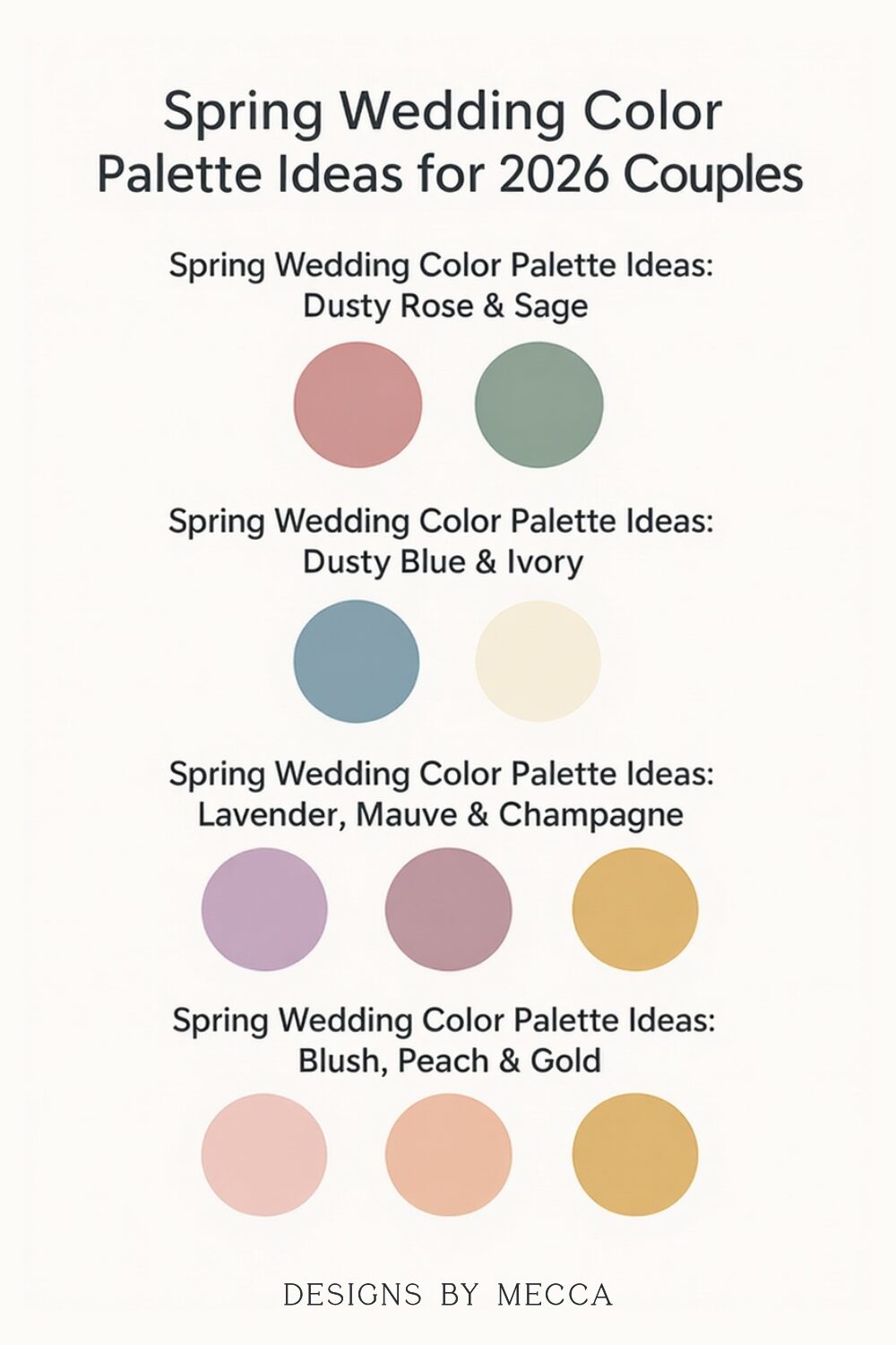
Dusty Rose & Sage
Dusty rose and sage are perfect for couples dreaming of a soft, romantic garden feel. The dusty rose adds warmth, while sage brings an airy, fresh balance. Together, they create a timeless look that feels both classic and modern.
For stationery, this palette shines through textured papers, delicate floral illustrations, vellum wraps, and wax seals in muted tones.
Best for: Garden venues, greenhouse weddings, or any space with natural greenery.
Pin this inspiration for later!
Images: Amanda Eloise Photography
Love this palette? See more sage and dusty rose inspiration from my own micro-wedding reception!
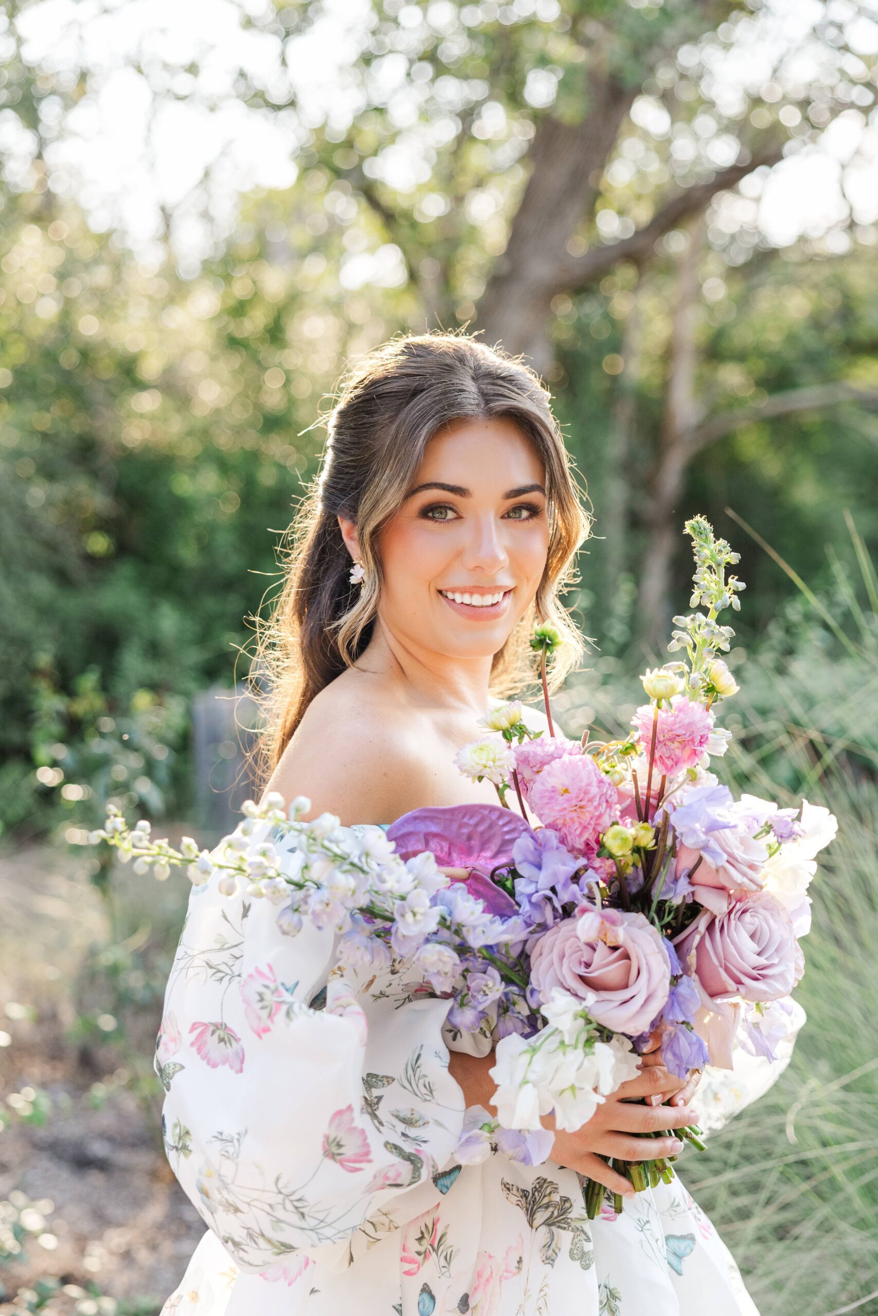
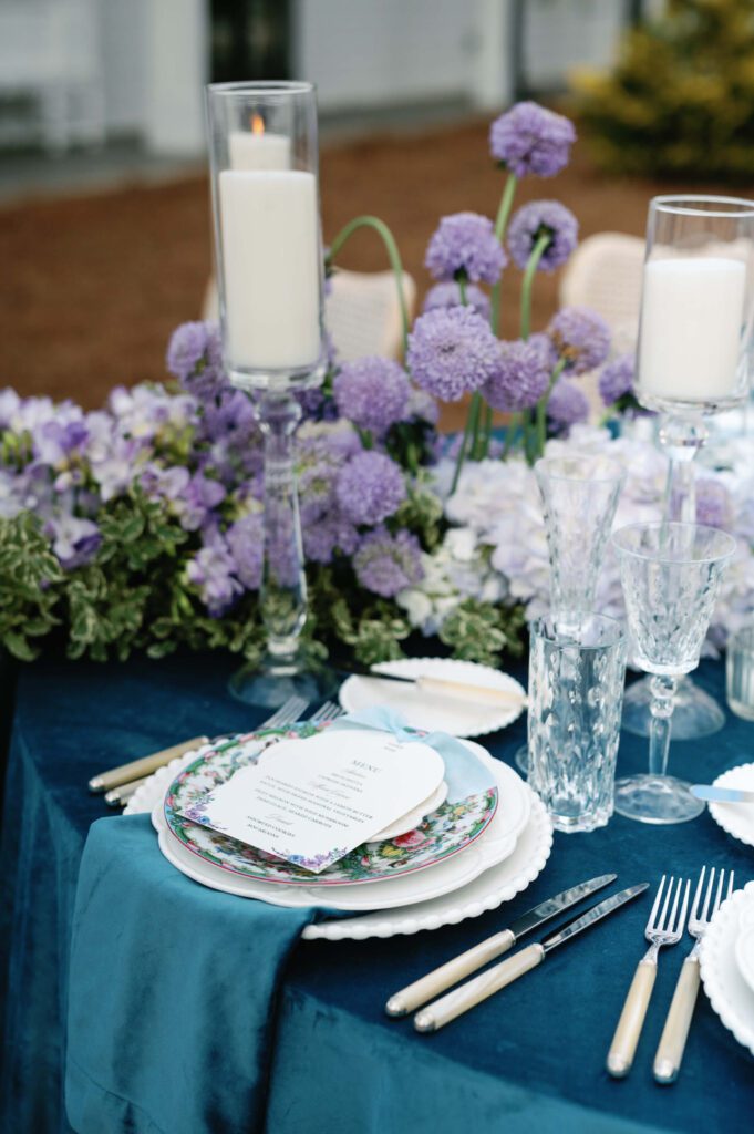
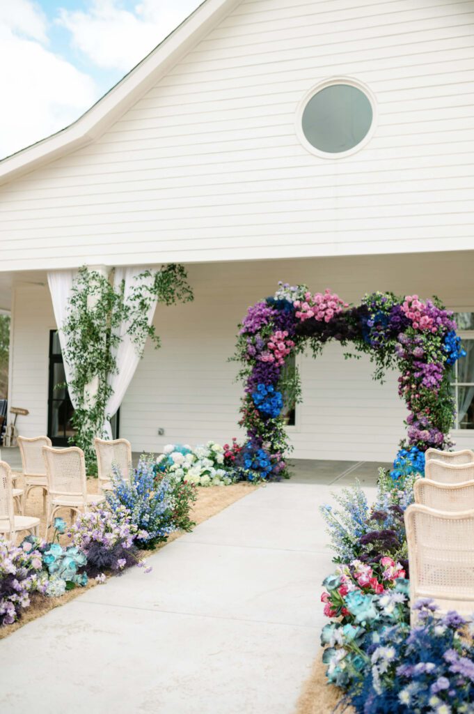
Shades of Purple & Blue
For couples who love a colorful spring palette, this combination brings a cheerful yet romantic feel. Deep purple adds a bold touch, soft purple brings in gentle warmth, and light blue keeps the overall look fresh and bright.
For stationery, this palette works beautifully with floral illustrations, textured papers, and envelope liners that highlight these soft spring shades.
Best for: Garden weddings, outdoor ceremonies, or any venue with lots of blooming florals.
Pin this inspiration for later!

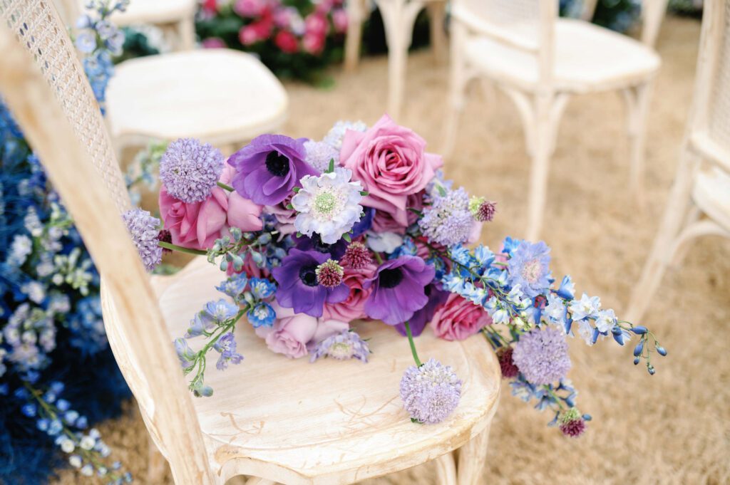
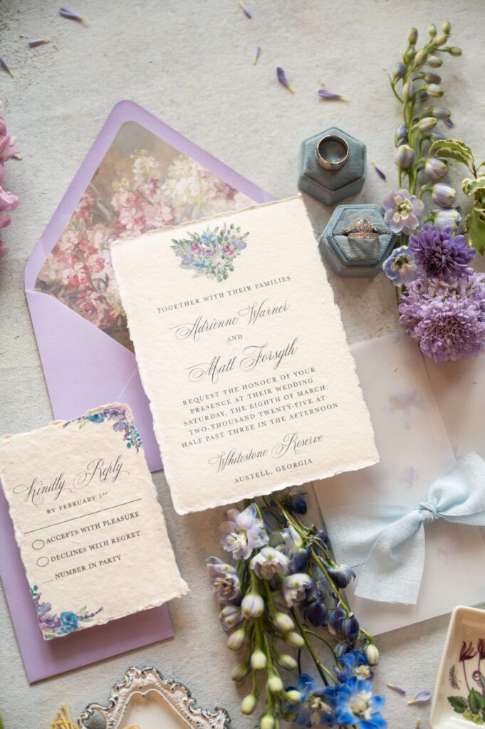
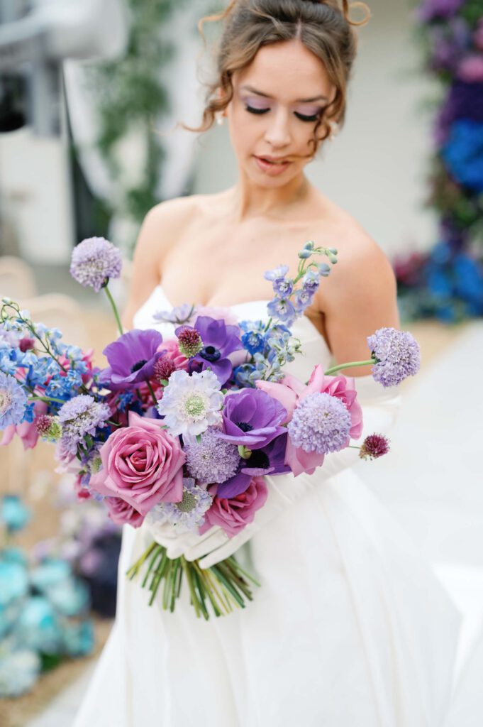
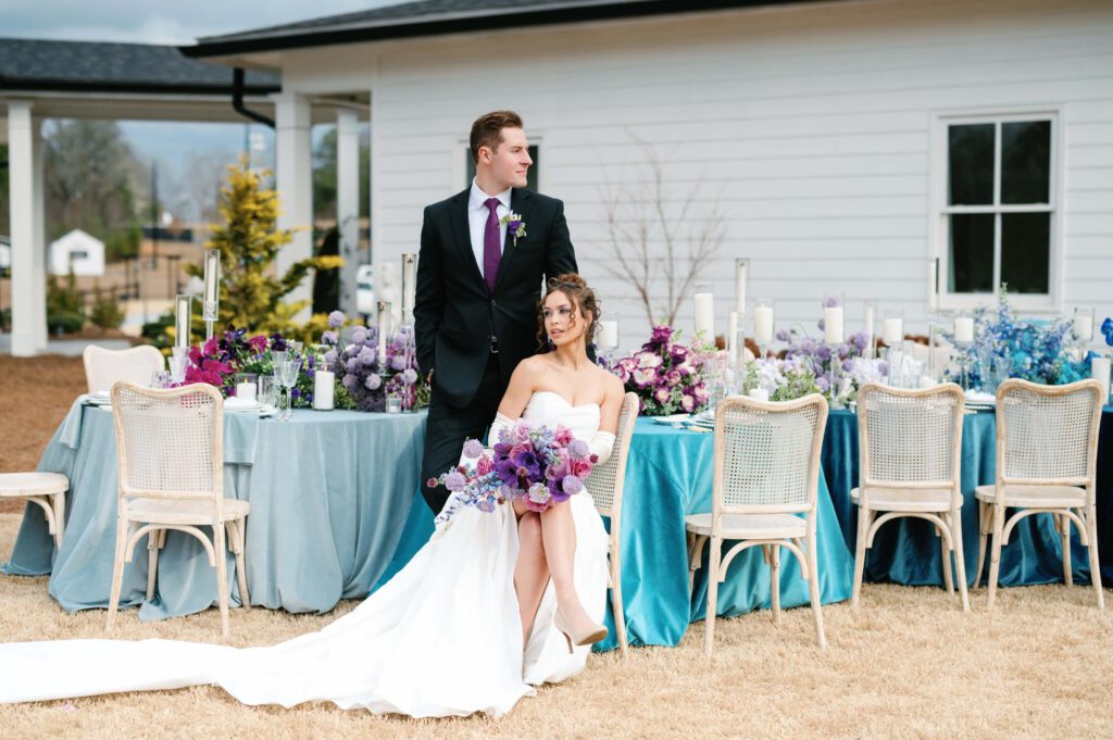
Images: Alaina René
Love this palette? See more inspiration from this colorful wedding at Whitestone Reserve!
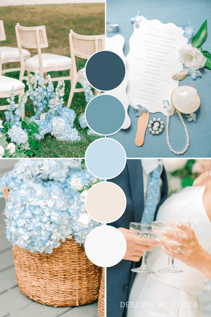
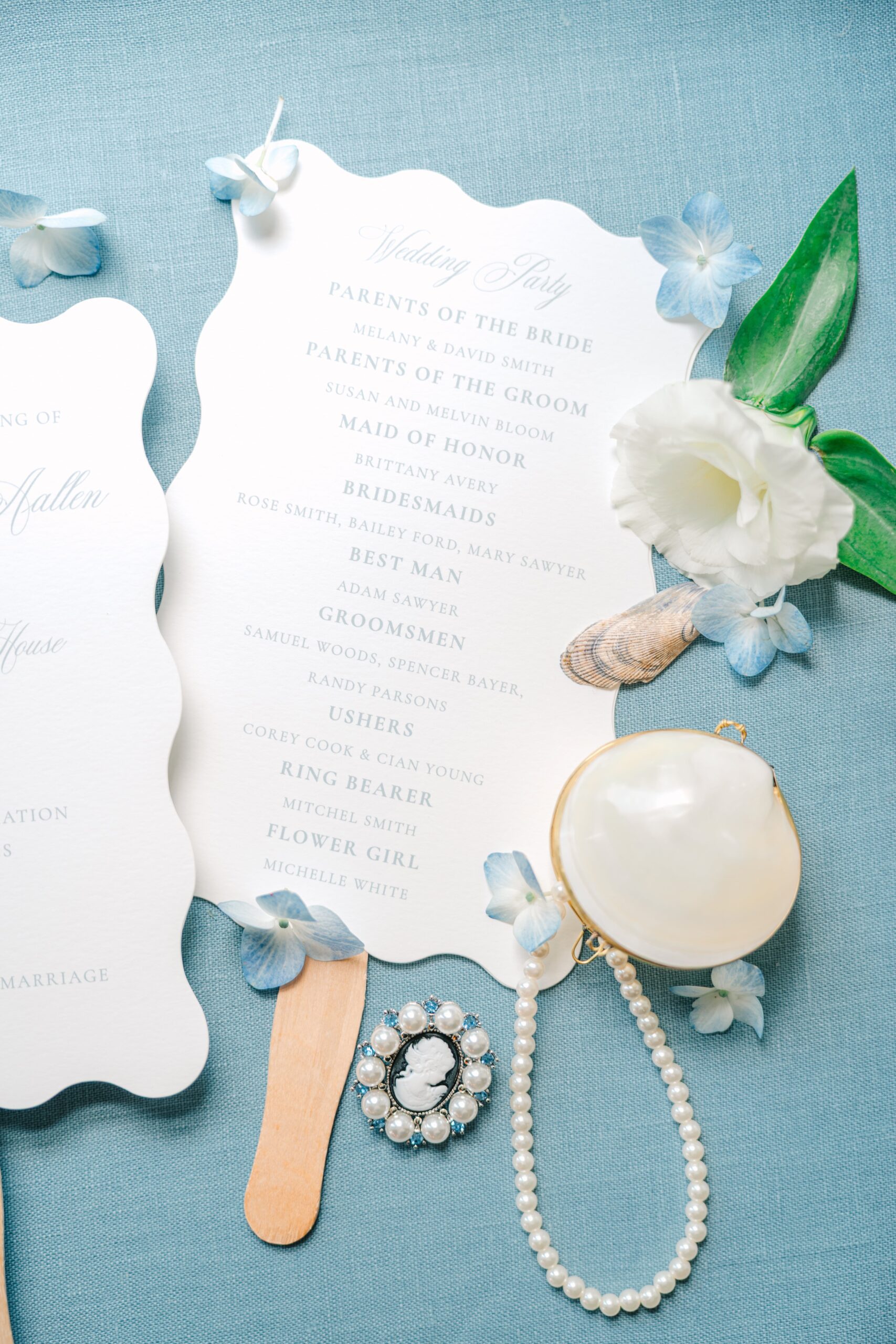
Dusty Blue & Ivory
Dusty blue and ivory remain one of the most beloved combinations for spring weddings. The dusty blue brings a serene, calming mood, while ivory keeps the design clean and elevated. This palette is perfect for couples who love tradition but also want something that feels updated and fresh.
For stationery, think letterpress printing, soft watercolor washes, and envelope liners featuring delicate botanicals.
Best for: Estates, lakeside venues, or elegant ballroom celebrations.
Pin this inspiration for later!
Images: Heather J. Photography
Lavender, Mauve & Champagne
For couples wanting something a bit more modern, this palette blends soft romance with subtle sophistication. Lavender brings freshness, mauve adds depth, and champagne ties everything together with a timeless glow.
This combination works beautifully for couples who want stationery that feels whimsical but still elevated—perfect for hand-torn edges, ribbon details, or custom monograms.
Best for: Outdoor ceremonies, winery weddings, or any venue with natural light.
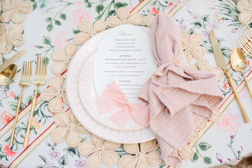
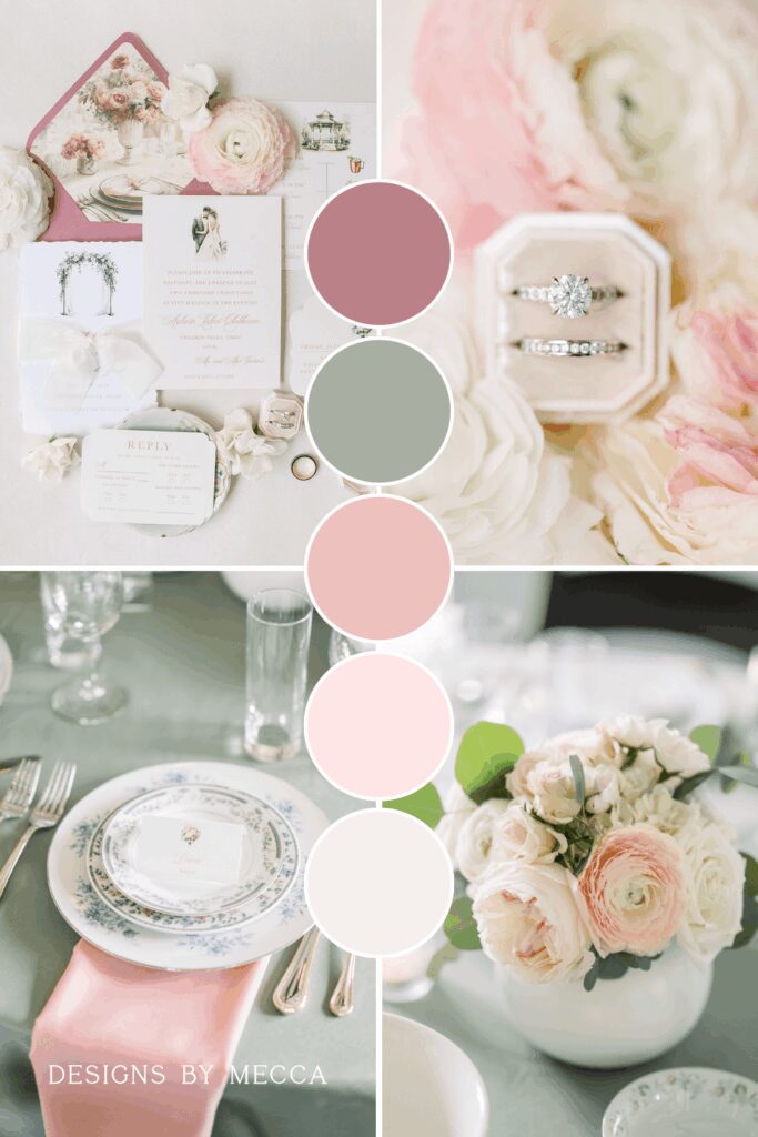
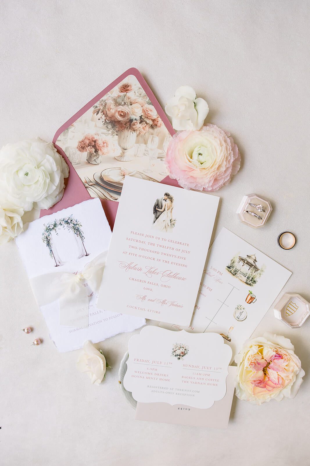
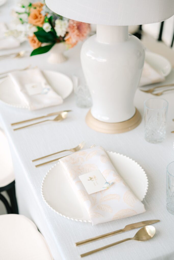
Blush, Peach & Gold
If you love warm, soft tones that feel cheerful and refined, this palette is a beautiful option. Blush and peach add gentle color while gold brings in a hint of luxury.
In stationery, this palette shines with foil accents, curved invitations, and floral envelope liners that tie the entire wedding aesthetic together.
Best for: Romantic garden weddings, tented receptions, or intimate spring elopements.
Even more spring color palette ideas to pin for later!
Let’s Bring Your Spring Wedding Color Palette to Life!
If these spring wedding color palette ideas inspired you, I’d love to help bring your vision to life. I work with couples who want thoughtful, elegant, and cohesive stationery that reflects their unique wedding style—from save the dates and invitations to day-of paper and signage.
If you’re planning a spring wedding and looking for elevated stationery design, inquire today to begin your custom experience.
Leave a Reply
DOWNLOAD NOW
DOWNLOAD YOUR free guide to WEDDING stationery timelines
Feeling excited but overwhelmed by wedding stationery? Simplify the process with our free guide to wedding stationery timelines! It’s your step-by-step resource to staying organized and stress-free while designing the perfect stationery for your big day.
Free Resource!

