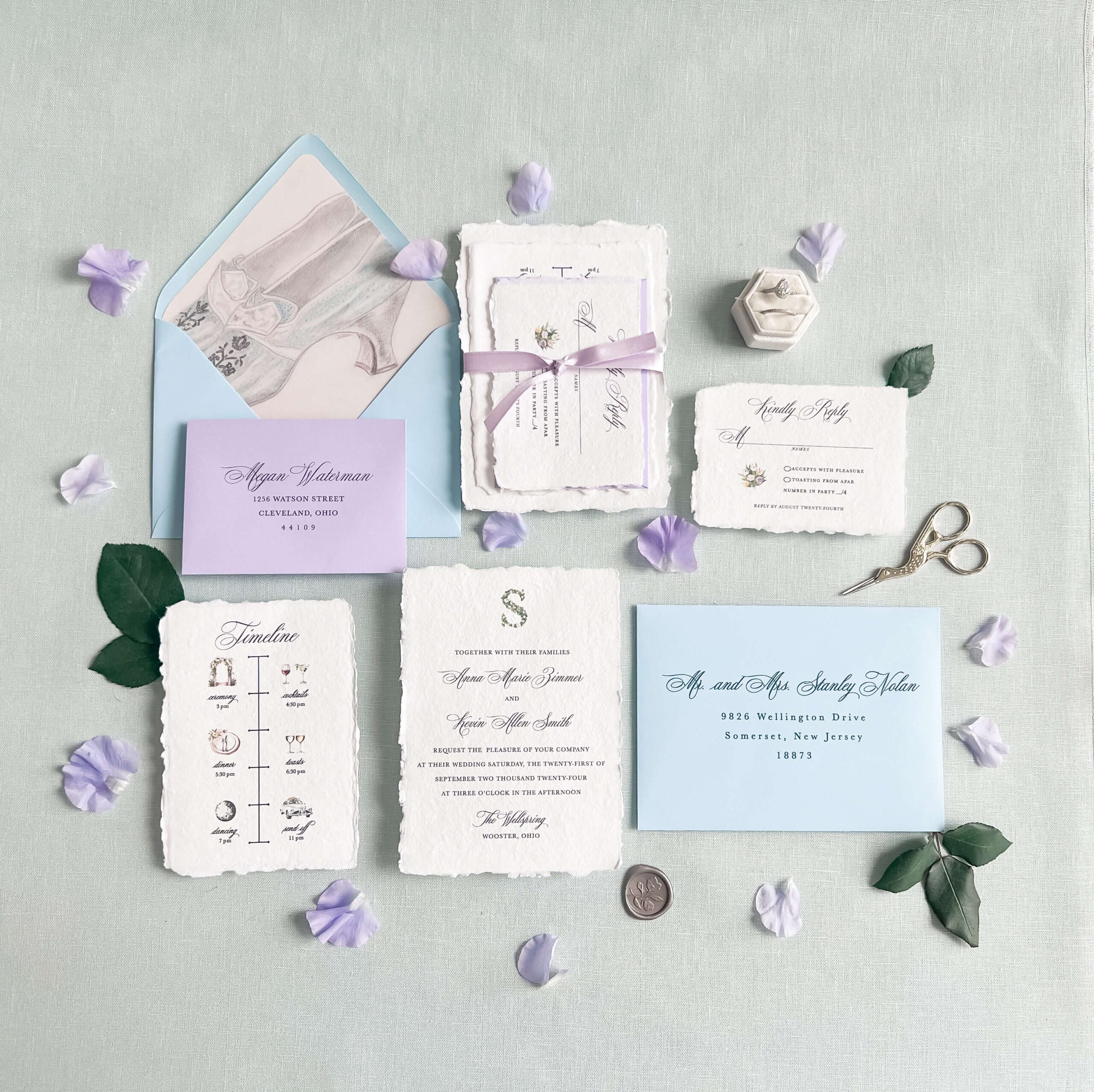
Wedding Invitation Design Ideas to Match Your Theme
Filed in Invitation Design — December 7, 2024
DOWNLOAD YOUR FREE GUIDE TO WEDDING STATIONERY TIMELINES
Free Resource
DOWNLOAD YOUR GUIDE
Browse by Category
Search the blog & press enter
A Cleveland-based designer specializing in whimsical and timeless custom wedding. stationery. I love creating meaningful designs that celebrate each couple’s unique story. On this blog, I’ll help you navigate the stationery world and bring your vision to life!
Hi i'm JoLynn
Your invitations are more than just a way to share logistics — they’re the first glimpse your guests will have into the style and mood of your celebration. That’s why thoughtful wedding invitation design ideas are so important. Whether you’re planning a romantic garden wedding or a modern city celebration, your stationery should reflect your overall theme and your personality. In this post, you’ll find wedding invitation design ideas for popular themes, with inspiration to help you bring every detail together beautifully.

Tips for Creating a Cohesive Wedding Invitation Design
Before exploring specific wedding themes, it’s helpful to understand how all the design elements work together. Start with the tips below to get a foundation for creating an invitation suite that reflects the overall style of your wedding.
- Start with Your Vision Board: Collect photos, color swatches, and textures that represent your theme to share with your designer.
- Match Materials: If your wedding decor features materials like wood, acrylic, or fabric, incorporate these into your stationery. Here are some more ideas for embellishments you can add to elevate your suite!
- Use Consistent Colors: Align your stationery palette with your wedding colors for a seamless look.
- Don’t Forget Day-of Details: Extend your theme to menus, place cards, programs, and signage to maintain a unified aesthetic. Here’s a full list of day-of wedding stationery you can’t forget about!
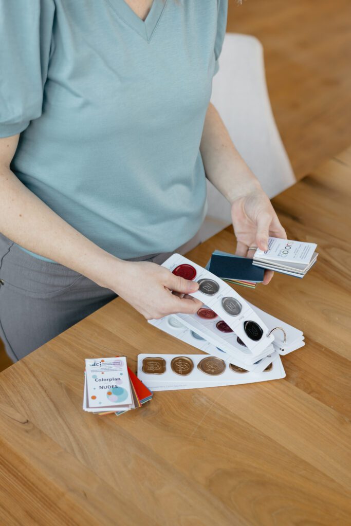
Wedding Invitation Design Ideas by Theme
Once the overall look and feel are in place, it’s time to tailor your stationery to the theme of your celebration. From romantic gardens to coastal destinations, these wedding invitation design ideas are styled to complement the setting and atmosphere of your day.
Romantic Garden Wedding Invitations
Soft, floral, and elegant — for couples drawn to natural beauty and intimate outdoor settings.
Key Design Elements:
- Watercolor florals
- Blush, sage, and dusty blue color palettes
- Calligraphy-style fonts or hand-lettering
- Silk ribbon and floral envelope liners
Example Invitation Design:
This suite features watercolor floral artwork, a pink envelope, and a sheer vellum wrap that captures the romance of a garden wedding.
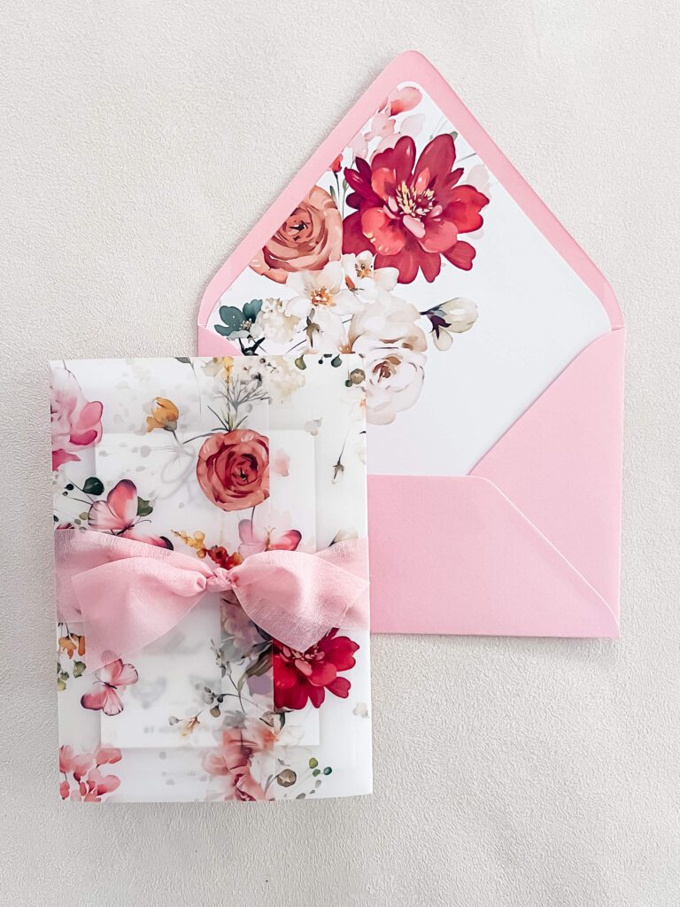
See even more romantic garden wedding stationery from this colorful wedding at Whitestone Reserve!
Classic or Formal Wedding
Ideal for traditional ceremonies in a ballroom or church, and formal black-tie receptions.
Design Elements:
- Serif and script fonts
- Formal layouts with classic language
- Monograms or family crests
- Navy, ivory, or soft blue tones
Example Invitation Design:
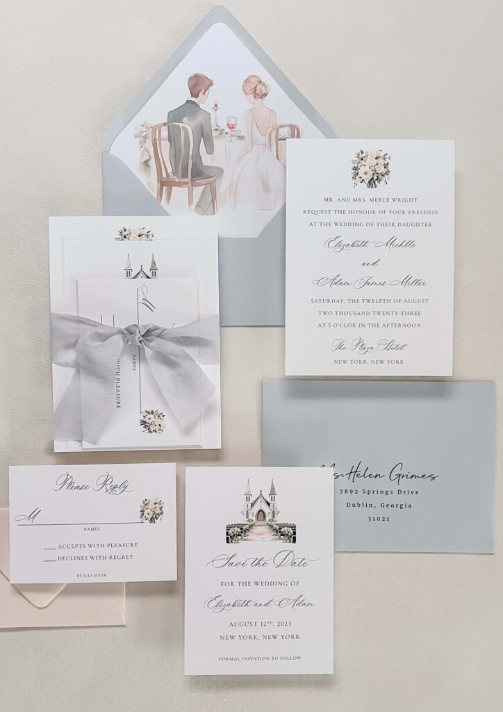
This suite features formal fonts, soft grey accents, and a custom liner illustration — perfect for a classic wedding at the Plaza Hotel.
Rustic Estate Wedding Invitations
Elegant but relaxed — often hosted at private estates, farms, or countryside venues. Think warm, earthy tones and natural textures for a laid-back vibe.
Key Design Elements:
- Handmade or textured paper
- Custom venue illustrations
- Soft neutrals like cream, taupe, terracotta, or muted green
- Delicate serif or hand-lettered fonts
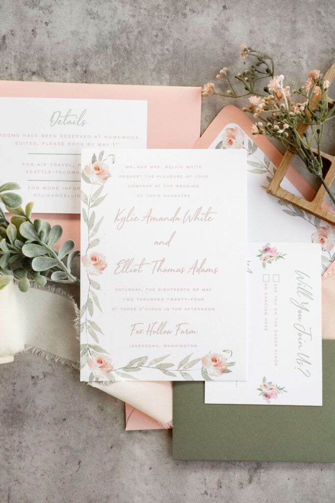
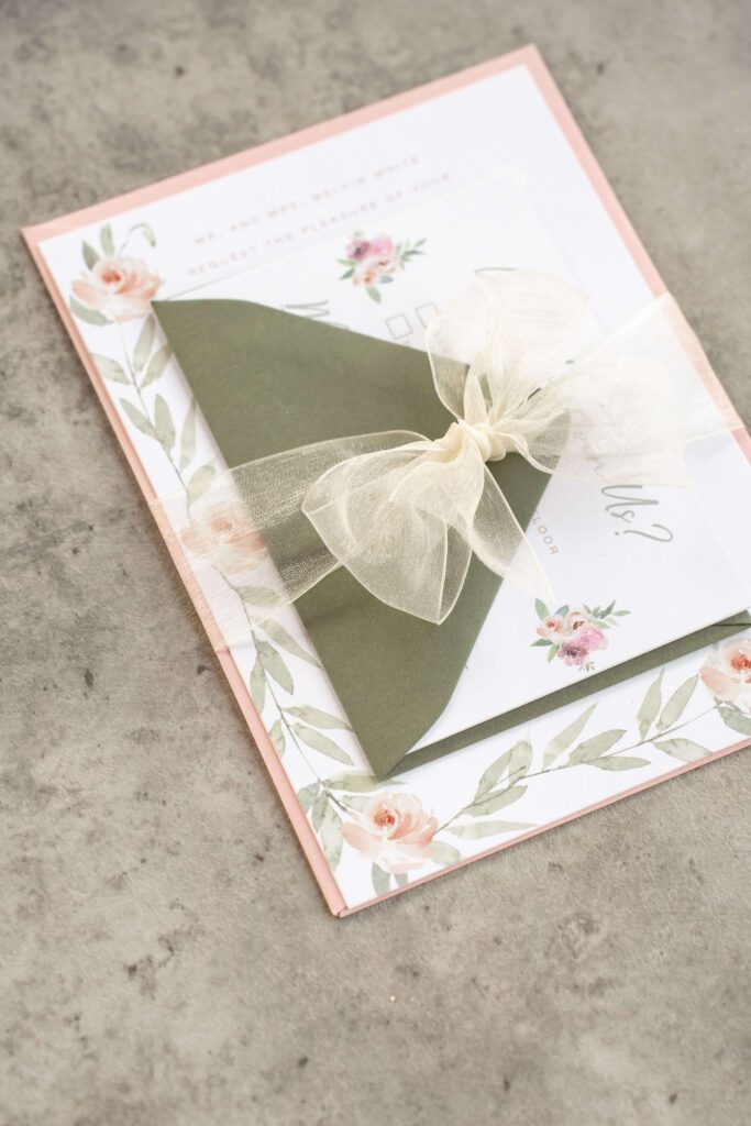
Example Invitation Design:
This suite features soft watercolor roses, greenery, and romantic script. It’s a beautiful fit for a rustic spring wedding.
Soft & Neutral Wedding Invitations
Understated and elegant — ideal for couples who love minimalist design with romantic undertones.
Design Elements:
- Cream, blush, gray, and white color palettes
- Velvet or silk ribbons
- Letterpress printing
- Monograms and crests
- Clean serif fonts or soft calligraphy
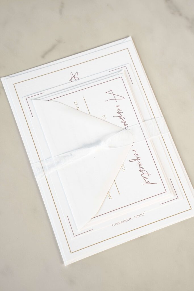
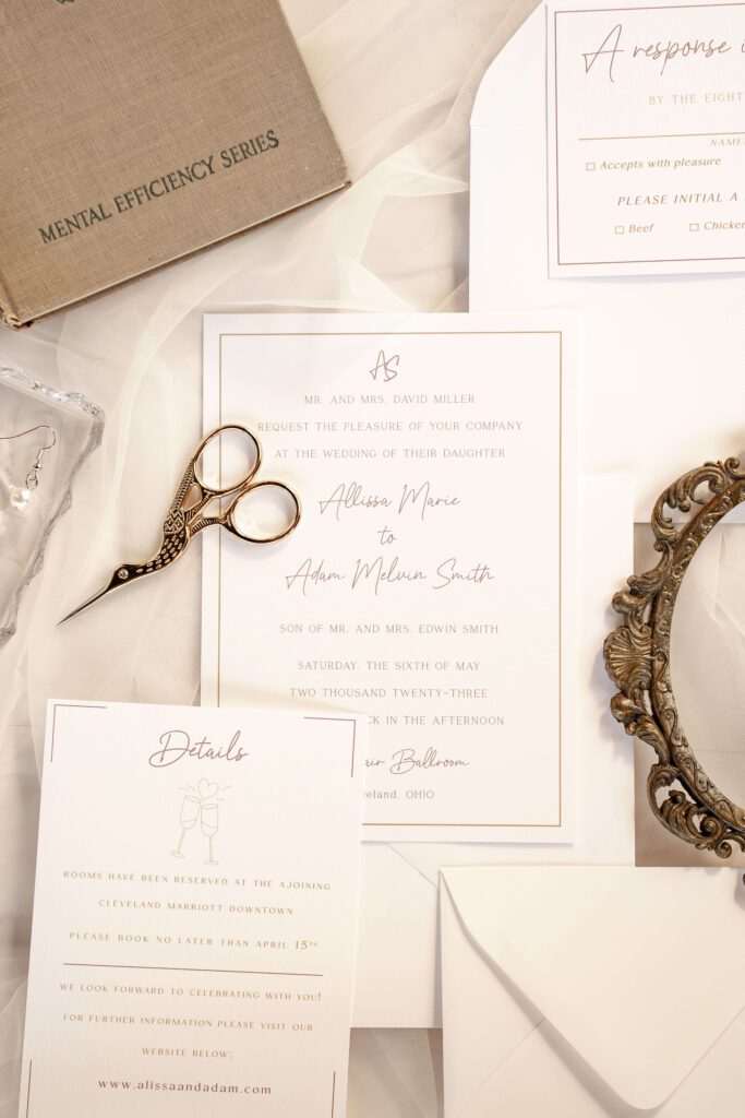
Example Invitation Design:
This suite features warm white paper, minimalist fonts, and a clean border, creating a soft and elegant look for a neutral-toned wedding.
Whimsical Outdoor Wedding Invitations
Playful and poetic — full of charm, imagination, and natural elements.
Key Design Elements:
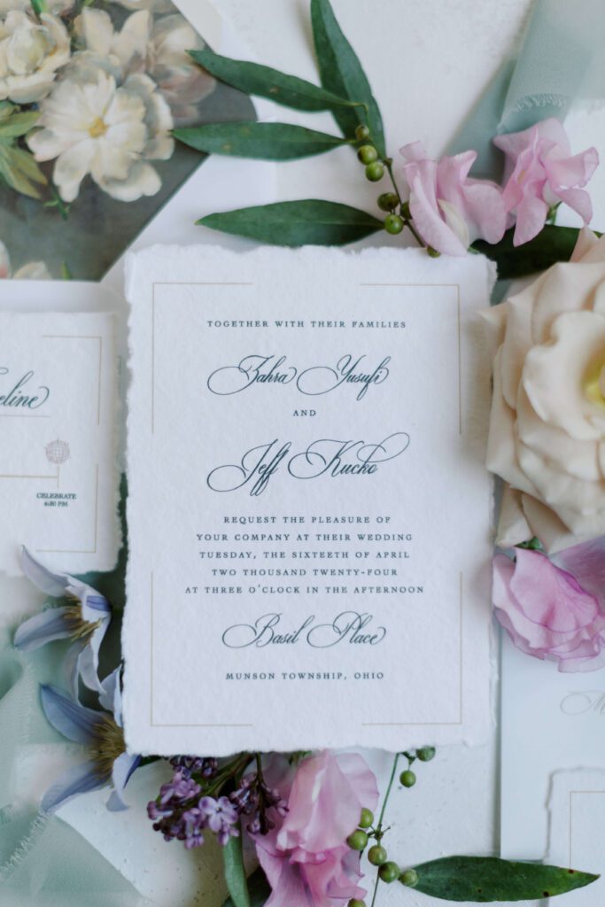
- Watercolor illustrations of wildflowers or flowing vines
- Deckled edges or handmade paper
- Blush pink, dusty blue, and soft cream tones
Example Invitation Design:
This invitation features handmade paper with deckled edges and a fine art floral watercolor invitation liner.
Love this suite? See even more from this romantic spring wedding at Basil Place!
Destination or Coastal Wedding Invitations
Fresh and airy — perfect for travel-loving couples or weddings set in scenic locations.
Key Design Elements:
- Light neutrals with touches of aqua or coral
- Tropical illustrations or map-style cards
- Clean layouts with modern fonts
- Simple embellishments like twine or seashell wax seals
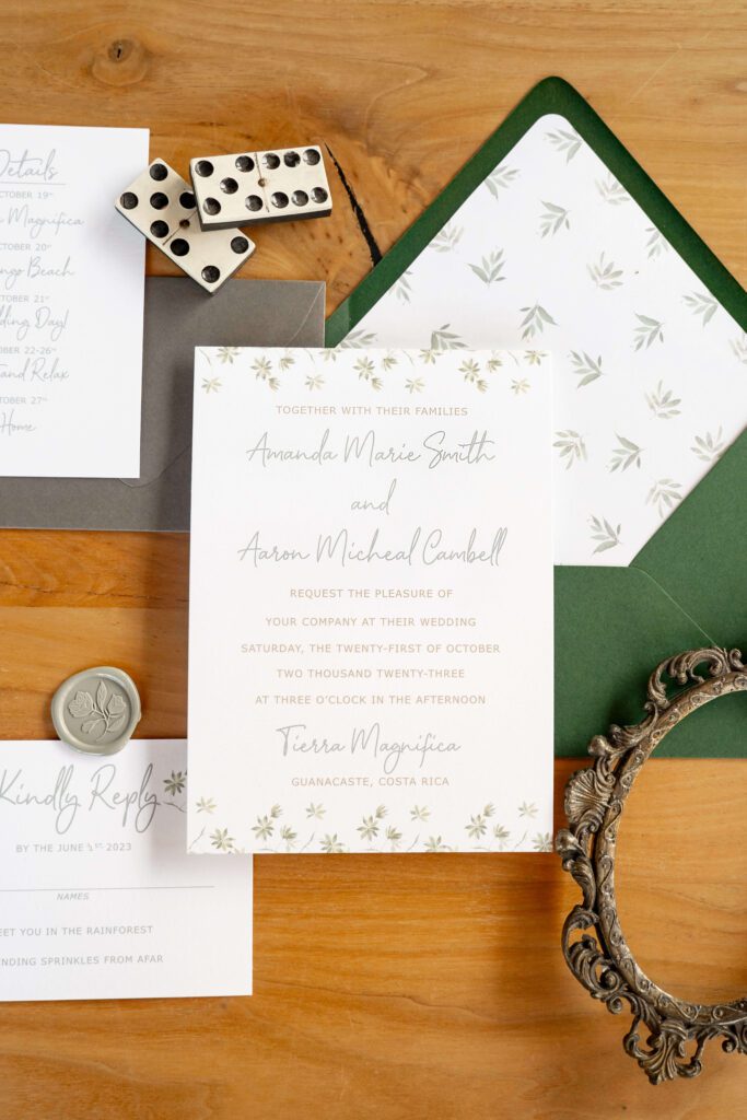
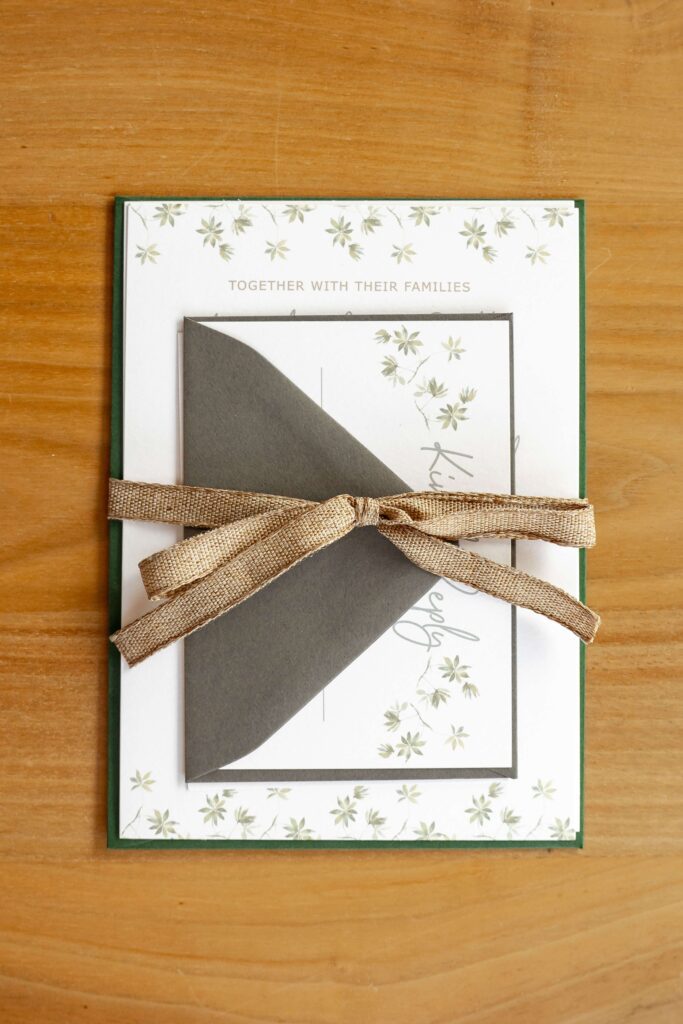
Example Invitation Design:
This tropical-inspired suite features a leafy border, modern script, and a bold green envelope liner, perfect for a destination wedding.
Glamorous & Luxe Wedding Invitations
Opulent designs that radiate elegance.
Key Design Elements:
- Metallic foiling in gold, silver, or rose gold
- Rich color palettes like black and gold, emerald green, or deep burgundy
- Velvet ribbons, embossed details, or monograms
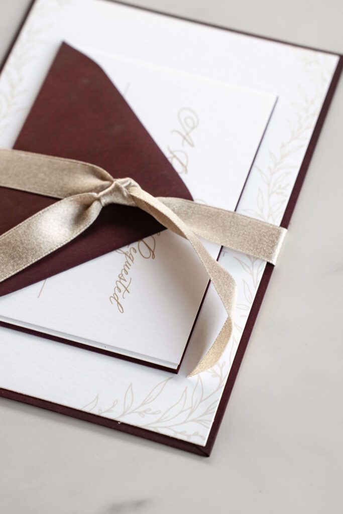
Example Invitation Design:
A burgundy invitation with gold font, paired with a luxurious champagne ribbon.
Bringing Your Wedding Invitation Design Ideas to Life
By choosing wedding invitation design ideas that reflect your theme, you’ll create a cohesive and unforgettable experience for your guests. From watercolor florals to custom venue sketches, your invitations are an opportunity to bring your love story to life on paper.
Ready to start designing? Explore more of our custom work or reach out to begin your invitation journey.
Leave a Reply Cancel reply
DOWNLOAD NOW
DOWNLOAD YOUR free guide to WEDDING stationery timelines
Feeling excited but overwhelmed by wedding stationery? Simplify the process with our free guide to wedding stationery timelines! It’s your step-by-step resource to staying organized and stress-free while designing the perfect stationery for your big day.