
Plum and Olive Wedding Invitation Designs You’ll Love
Filed in Invitation Design — June 25, 2026


If there’s one wedding color palette having a real moment right now, it’s plum and olive. I’m seeing a lot of couples drawn to moodier, nature-inspired tones like plum, olive, merlot, and fig. Honestly? I’m loving it. The combination is stunning: rich, romantic, and a little unexpected. Plus, it’s especially beautiful on your wedding invitations.
That’s where I come in. Today I’m sharing why plum and olive works so well, the weddings it suits best, and three plum and olive wedding invitation suites I designed to show you how versatile it can be. Whether you’ve already fallen for this palette or you’re still deciding your colors, you’re in the right place. Let’s take a look!
Why Plum and Olive Work So Well Together
Plum is deep, moody, and dramatic. Olive is soft, earthy, and calm. Put them together and each one balances the other perfectly. The plum brings richness while the olive keeps it grounded and natural.
That balance is what makes the palette so stunning. It’s romantic, rich, and earthy all at the same time. I can see exactly why couples are falling for it.
The best part? Plum and olive can go any direction you want. Dress them up for something formal, soften them for a garden feel, or keep them bold and modern. Same two colors, completely different moods.
The Best Season for a Plum and Olive Wedding
One of the best things about plum and olive is that it works for any season. Deep plum and warm olive look rich in autumn and just as striking in winter, especially in candlelight. In spring and summer, the same colors lighten up (try the softer dusty olive range) and are stunning at outdoor weddings. Pair the plum with bright olive green and a touch of cream for a romantic, fresh look.
For more seasonal inspiration, see my spring wedding color palette ideas.
Wedding Venues That Suit This Color Palette
Couples are using plum and olive everywhere from garden ceremonies to candlelit ballrooms. The palette works just about anywhere, but it really comes alive in spaces with natural texture or warm, moody lighting. I particularly love it for vineyards, glass greenhouses, and outdoor garden venues.
If you want to see more moody color palettes in action, check out these weddings:
- Glass Greenhouse Venue: Dramatic Wedding in Shades of Red
- Industrial Downtown Venue: Candlelit Wedding With Velvet Draping
Plum and Olive Wedding Invitation Designs to Inspire You
Your wedding invitation suite tells guests what to expect long before your big day arrives. It hints at your colors, your style, and how formal the day will be. That’s exactly why plum and olive are so fun to design with. The same two colors can be formal, romantic, or modern depending on how you style them.
To show you, I designed three suites in this palette, each one telling a slightly different story.
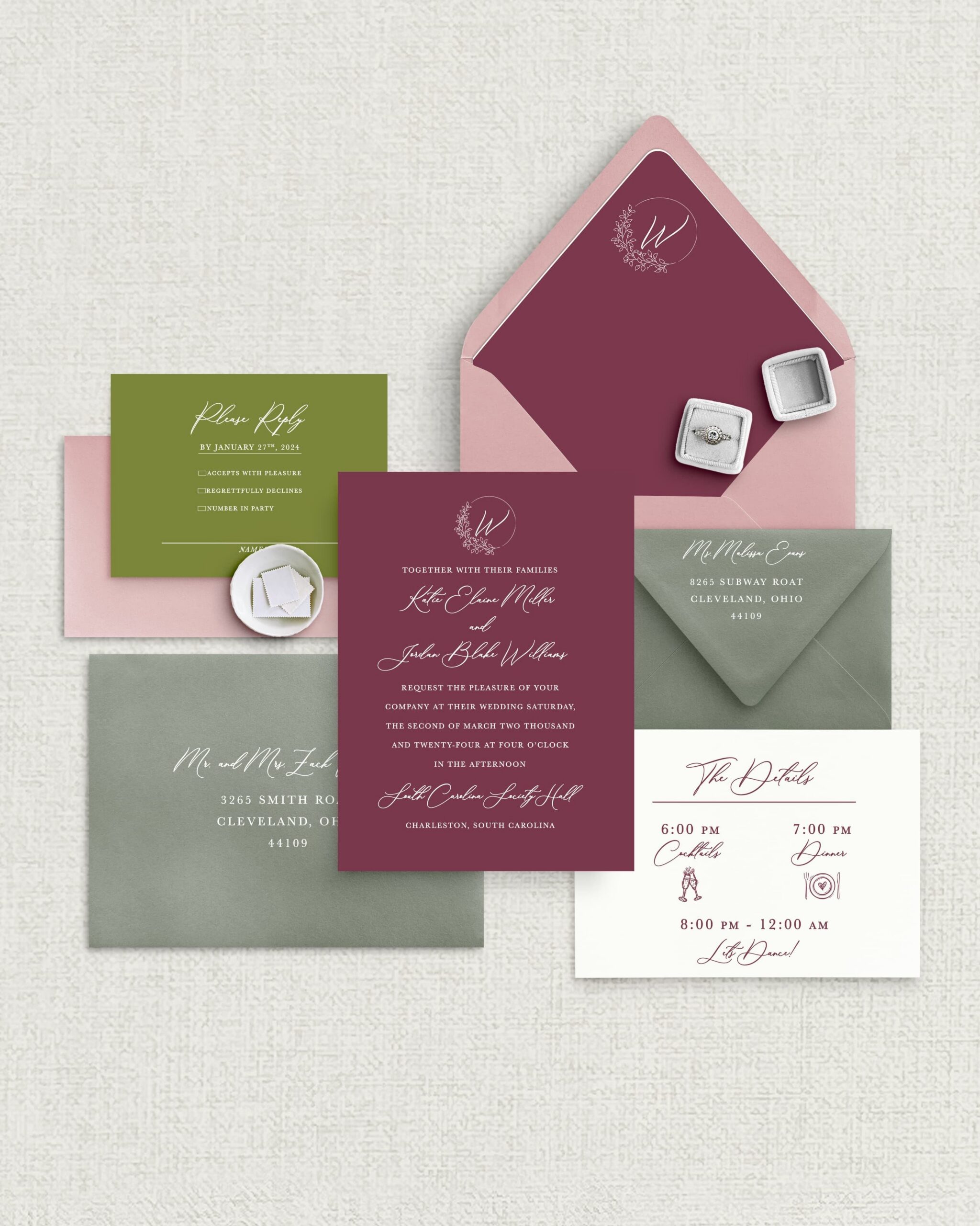
Modern Plum and Olive Invitation Suite
For this first suite, I chose a rich plum and shades of green. Crisp white text pops against the plum invitation card and bright olive reply card. The sage and pink envelopes help round out the palette. I added a few extra embellishments to add personality: hand-drawn icons and a simple crest.
This suite would be perfect for a couple who wants their stationery to look current and design-forward. I’d pair it with a vineyard, a boutique hotel, or even a contemporary downtown venue.

Classic Plum and Olive Invitation Suite
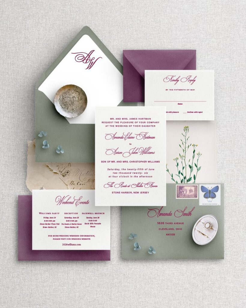
For this next suite, I went timeless and traditional. The invitation pairs plum lettering with a cream card, kept formal with a classic script font. The color carries through to a sage envelope and a deeper plum outer envelope. To complete the suite, I designed a coordinating reply card and details card.
This suite would be perfect for a couple planning a more formal, elegant celebration. The traditional layout and layered envelopes set the tone for a refined day. I’d pair it with a historic estate, a country club, or a classic ballroom.
Romantic Plum and Olive Invitation Suite
For this last suite, I leaned into soft and garden-inspired. Watercolor florals and olive greenery frame the invitation, then carry onto the envelope liner for a cohesive look. I chose natural, flowing script font in olive and plum. Finally, the plum and green envelopes tie everything together.
This suite would be perfect for a couple planning a romantic, nature-filled day. The watercolor florals and olive greenery set the tone for an outdoor wedding. I’d pair it with a garden estate, a glass greenhouse, or even a vineyard.

Bring Your Plum and Olive Wedding Invitations to Life
Plum and olive give you a palette that works in any season and bends to whatever style you want, from modern to formal to romantic. The same two colors can carry your whole wedding, starting with the very first envelope your guests open.
If this is the look you’ve been dreaming of, I’d love to design custom stationery to match. Reach out and let’s create something beautiful together!
Leave a Reply
DOWNLOAD NOW
DOWNLOAD YOUR free guide to WEDDING stationery timelines
Feeling excited but overwhelmed by wedding stationery? Simplify the process with our free guide to wedding stationery timelines! It’s your step-by-step resource to staying organized and stress-free while designing the perfect stationery for your big day.
Free Resource!

